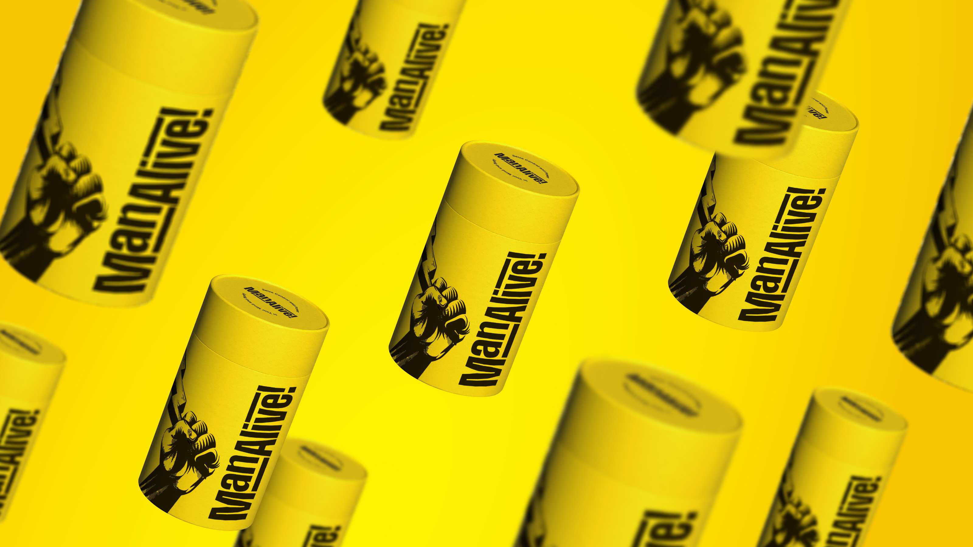
Here at Wonderstuff we value the importance of well-executed typography, it can make or break a brand.
With that said, here is a short article about the importance of typography, written by our recent Intern, James Cope.
How to use the power of type to push your business
Every design agency strives to create what we know as “great design.” Great design for some could mean aesthetically pleasing visuals with no real meaning; for others it’s much more important to have a well thought out, driven concept where the design aesthetic comes after. One fundamental element that often gets less consideration over colour, style and layout is the typeface.
Why does type need to be considered and is it important?
Creating the correct visual style does not necessarily have to be through graphical treatment, a typographic approach can also lend itself when establishing the appropriate aesthetic. The choice of a typeface can change the way a brand is perceived; it is not only a means of communication, or a vehicle for a message; but it can encompass character and present emotion without the need for a dominant visual graphic. The way a message is set typographically and the typeface its set in can dramatically affect the way it’s read and its intentions on the reader. Ellen Lupton who wrote the book Thinking With Type states,
[stag_intro]“Sometimes good typography is heard, not seen.”[/stag_intro]
This point under pins the job of a typeface, its not just to be read but it should have a voice that is noticed, understood and remembered.
Case Study: IKEA
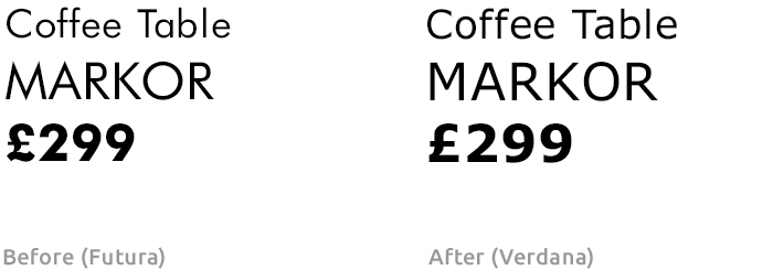
In 2010 IKEA changed its typeface on all media, from Futura to Verdana. The change was made because at the time Futura didn’t have a web safe font, which meant they would need two different typefaces for online media and print. This could potentially decrease its effectiveness and dilute the visual brand. One main problem with using Verdana was that many companies were using it, along with it also being a default font on Microsoft computers. The over usage of Verdana meant that IKEA’s catalogue and printed material along with their website looked like any other company selling products, rather than beautiful industrial design to match the continuity of their products.
Large companies often change their typeface to stay up-to date and contemporary, generally this change goes unnoticed and the typeface change just becomes acceptable and overlooked. Yet this is not the case with IKEA, it seemed not only the design community picked up on their type change but also the general public. This sparked debates and controversy with a petition posted online for IKEA to change back to Futura; named “IKEA, please get rid of Verdana!” which received over 7,000 signatures. Although they received some bad publicity originally, IKEA still use Verdana today. Ironically after a short period Futura released a web safe font, which would have eliminated the original problem. From a design perspective moving back to Futura would have seemed like a good decision; however this would involve huge costs, which would not have been beneficial to the business. This presents IKEA with a dilemma, focusing on the aesthetics and the feel of the brand as a pose to financial cost.
The back-bone of good design
In summary type plays a big part in creating great design. The typeface, along with the colour, styling and imagery are the forefront of a company or brand. The customer base will feel connected with a brand when all these elements are applied correctly. It is paramount for a brand to have this structure carried through in all aspects of the business, including social media and copywriting to maintain a strong customer rapport.
This article summarises “The Psychology of Typography: Cognitive decision making and the reception on commercial type design.” a Dissertation by James Cope, 2014.
If you’d like to talk type – hello@wonderstuff.co