You may have read my post back in February where I spoke about my past experience in teaching Graphic Design and how I have a love for supporting and inspiring others.
One way of inspiring those around me is by sharing examples of incredible creative work on my LinkedIn that has particularly caught my eye, and what will inspire my future creative work. Therefore I thought it may be beneficial to share my top 3 pieces of design inspiration from the past month!
If you want to continue to see what I’m looking at, connect with me on Linkedin.
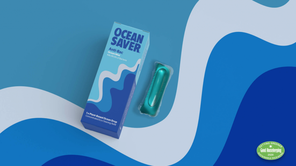
Ocean Saver plant based cleaning products packaging design by Someone.

What a brilliant product! Ocean Saver is a range of plant based cleaning products. By dropping dissolvable pods into water, you’re cutting down on the single use of plastic bottles, as well as many other benefits, one more is that you’re saving on the transportation of the water in usual cleaning products. The identity by Someone sands out from its crowded cleaning product marketplace and uses a bold, positive and graphic style right from launch, to reflect the positive impact this will have on our environment. I love start ups that are doing something to help our earth 🙂 Read more about the project here.
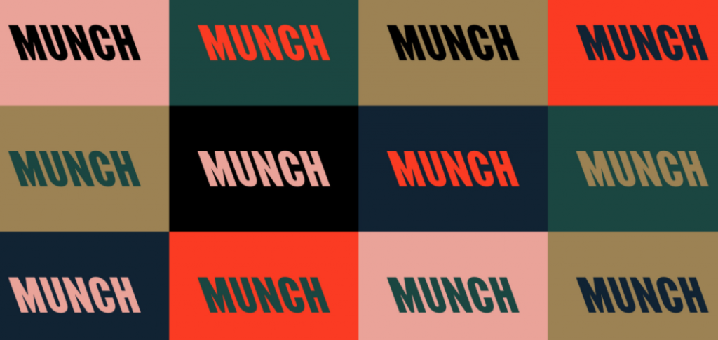
A typographic identity by North for a new art museum based in Oslo.

Loving this striking new identity by North, for Oslo’s Munch museum. The new art museum is said to be aiming to balance the Norwegian artist’s iconic image and engage more diverse audiences. A bold and confident typographic approach which shows lots of diversity and movement purely through the type is definitely reflective of their goal. This paired with a unique and brave colour palette makes a very expressive museum identity. Read more about the project here.
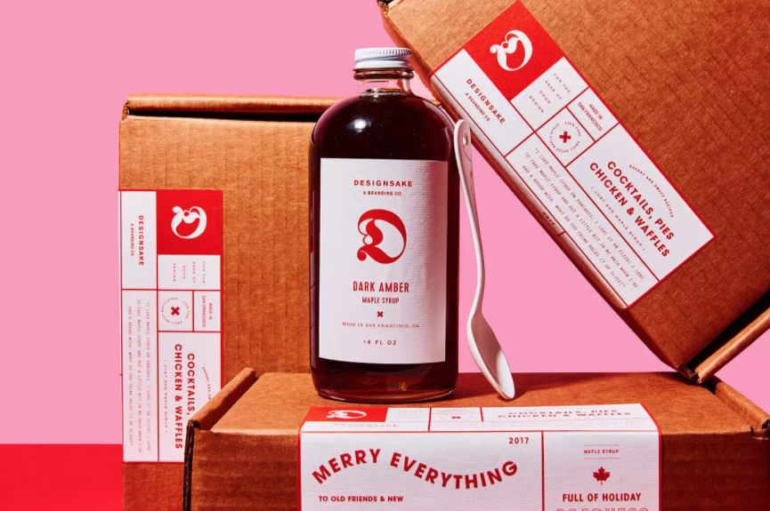
Beautiful and simplistic maple syrup packaging design by Designsake Studio.

Beautiful and simplistic packaging design by Designsake Studio for a limited edition range of maple syrup. Bright red and pastel pink are one of my favourite colour combinations, and they have definitely done it justice with this piece of packaging and art direction. I love how you’d never guess that this design was for maple syrup if you saw it on a shelf – it’s so unique and looks very much like a gift with it’s boutique style. Read more about this project here.
If you’d like to see more inspiration that I find and share – stay involved through my Linkedin posts.
